
Shopify Mobile Cart Optimization: 8 Tactics to Increase AOV
Most Shopify stores focus heavily on product pages and checkout optimization. But in many cases, the biggest conversion leak happens before checkout even begins. The cart.
.png)
And on mobile, this matters even more.
For most Shopify stores, over 70% of traffic comes from mobile devices. Yet many carts still feel like desktop leftovers: small buttons, unclear direction, too much friction, and no momentum.
The result?
Lower conversions, lower average order value, and more abandoned carts.
The good news is that improving your mobile cart experience can dramatically improve both conversion rate and AOV - often without changing your products or traffic at all. Here's a video breakdown of the article:
And here’s 8 tactics that actually make a high-converting Shopify mobile cart work.
1. Keep Momentum Alive With a Slide Cart
One of the biggest mistakes stores make is interrupting momentum.
On many Shopify themes, clicking “Add to Cart” reloads the page completely.
That small interruption matters more than most people realize.
Mobile shoppers make decisions quickly. When the page refreshes, the buying flow resets.
That hesitation creates drop-off.
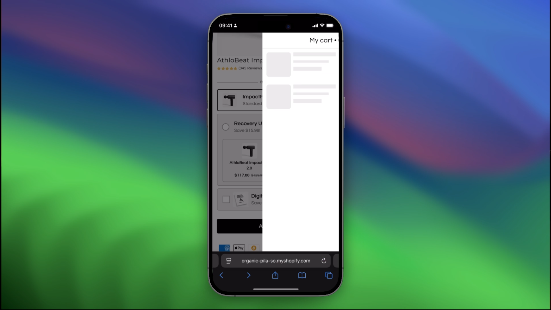
A slide-in cart solves this problem.
Instead of reloading the page:
- the cart appears instantly
- the shopper stays in the same flow
- the product stays visible
- momentum continues
This creates a much smoother buying experience and keeps the shopper mentally engaged.
2. Give Customers a Clear Goal
Most carts don’t guide the customer at all.
You open the cart and see:
- products
- total price
- checkout button
That’s it.
High-converting carts work differently.
They create direction.
One of the simplest examples is a free shipping progress bar.
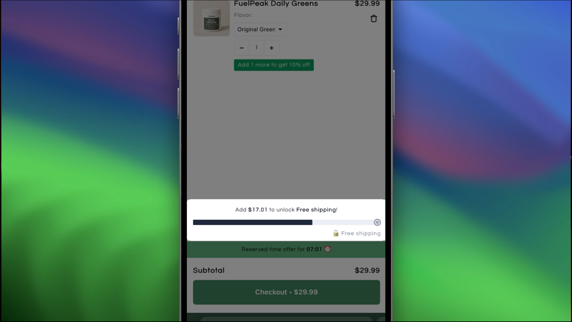
Instead of wondering whether they should add more, customers start thinking:
“What can I add to unlock free shipping?”
That psychological shift is huge.
You can also guide shoppers using:
- bundle discounts
- quantity incentives
- spend thresholds
- reserved offer timers
The goal isn’t to pressure people.
It’s to make the next step obvious.
3. Use Upsells Without Creating Friction
Many upsells fail because they interrupt the buying experience.
Aggressive popups and unrelated products usually hurt conversions more than they help.
Good in-cart upsells feel different.
They feel useful.
For example:
If someone adds a portable espresso maker, the cart can suggest:
- coffee capsules
- travel case
- portable grinder
These suggestions feel natural because they support the main purchase.

And when tied to goals like:
- free shipping
- free gift unlocks
- bundle savings
…customers are much more likely to add them.
This is one of the easiest ways to increase AOV without adding friction.
4. Set Smart Free Shipping Thresholds
A common mistake is setting free shipping thresholds too high.
If your average order value is around $40, setting free shipping at $90 feels unrealistic.
But setting it around $50 changes the psychology completely.
Now the goal feels close.
That’s important.
The brain responds much better to short, achievable gaps than large jumps.
Then all you need is:
- one add-on
- one small bundle
- one simple upsell
This turns the cart into a guided buying experience instead of a static page.
The exact threshold depends on your store, so testing matters.
But the principle stays the same:
Make the next step feel easy.
5. Turn the Cart Into a Decision Hub
The cart is where many final buying decisions happen.
Questions like:
- “Should I subscribe instead?”
- “Is there a better deal?”
- “Can I save more with a bundle?”
…shouldn’t be hidden somewhere else on the store.
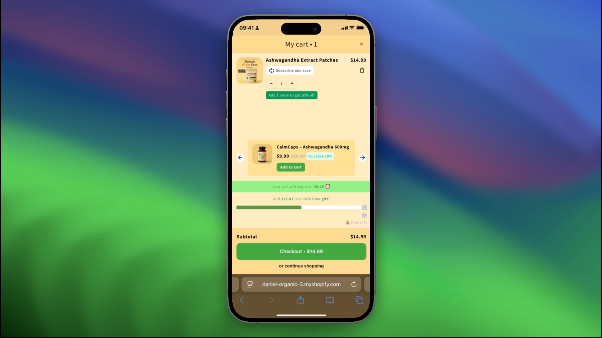
When subscriptions and bundles are visible directly inside the cart, they feel less like upsells and more like helpful options.
That changes how customers perceive them.
Subscriptions feel convenient.
Bundles feel like better value.
And because the customer is already engaged, conversion rates are usually much higher here.
6. Add Trust Signals Before Checkout
Even when pricing and offers are good, customers can still hesitate.
Usually because of uncertainty.
Right before checkout, shoppers silently ask themselves:
- “Is this store trustworthy?”
- “Can I return this?”
- “Is checkout secure?”
That’s why trust signals inside the cart matter.
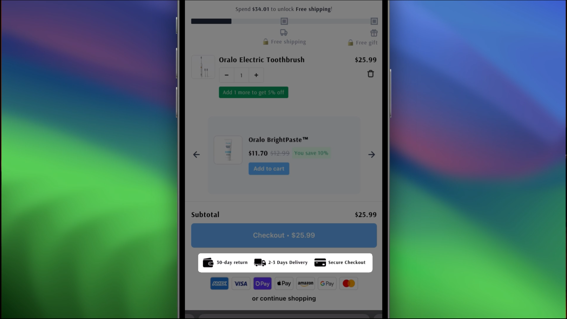
Simple additions like:
- secure payment icons
- delivery information
- return guarantees
- fast shipping messaging
…can noticeably reduce hesitation.
Trust doesn’t need to be overexplained.
It just needs to be visible at the moment of decision.
7. Optimize for Real Mobile Behavior
Mobile users behave differently from desktop users.
They scroll quickly.
They’re distracted.
They shop with one hand.
They make decisions fast.
This means:
- tiny buttons hurt conversions
- crowded layouts create friction
- unclear actions get ignored
High-converting mobile carts prioritize:
- large tap targets
- clear spacing
- readable text
- one obvious next step
On mobile, clarity almost always outperforms complex design.
8. Keep the Checkout Button Visible
One small detail makes a surprisingly big difference:
Persistent checkout buttons.
Many carts allow the checkout CTA to disappear while scrolling.
That forces users to hunt for the next step.
And on mobile, every extra action creates friction.
A sticky checkout button keeps momentum alive because the next action is always visible.
Small UX decisions like this often have a bigger impact than redesigning the entire store.
Final Thoughts: High-Converting Carts Remove Friction
The best Shopify carts don’t convert better because they “sell harder.”
They convert better because they guide the customer clearly.
They:
- maintain momentum
- reduce hesitation
- create direction
- simplify decisions
And that alone can dramatically increase conversion rate and average order value.
Want to Build a Better Shopify Cart Experience?
If you want to implement things like:
- slide cart drawers
- free shipping bars
- in-cart upsells
- bundles
- subscriptions
…make sure to check out Kaching apps.
Apps cover most of what I listed above, and for a lot of stores that is where it ends. Settings only reach so far.
That is when you bring in a Shopify development agency. ECORN is a certified Shopify Expert that builds this work custom: slide carts, checkout UI extensions, upsell and bundle logic, free shipping bars, full cart drawer customization.
The code goes into your theme and Shopify's native infrastructure instead of loading as one more app, so you are not chasing plugin conflicts or paying the page weight on every visit. Nothing is boxed into an app template.
They have shipped cart work for DTC brands in fashion, beauty and consumer goods, from scoping through deployment.
Everything shown in this article was built using Kaching Cart Drawer, which works seamlessly with other Kaching apps like Bundles and Subscriptions to create a smoother mobile shopping experience inside Shopify.


Start your free trial
Join over 30,000+ merchants already growing with Kaching Appz®.

